Swetha Ramaswamy

Reimagining job applications

The Problem

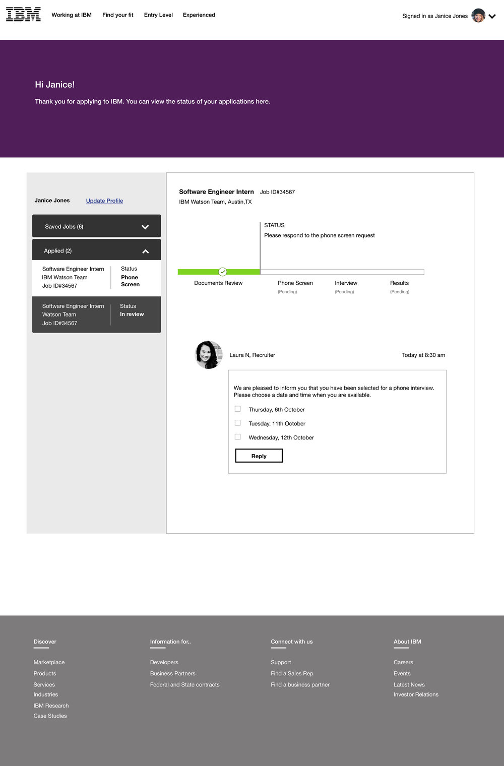
The job application experience is painful, for both candidates and hiring teams.
As part of a pitch project, IBM asked us to reimagine the traditional hiring process. The current process takes weeks to complete, and receiving thousands of applications places a huge workload on hiring teams. In addition, candidates have to wait for weeks before receiving any answer- this causes a great deal of anxiety.
So, How do we design an experience that alleviates anxiety, and increases transparency?

My Role

I led interaction, visual design and usability testing.

Impact

IBM’s team learned about how younger students perceived them & how IBM’s jobs and projects compared with companies like Meta & Google. This enriched the team and led to conversations about how the brand could appear more ‘new age’ in universities.

The Design Process

Finding a job is hard. So is finding the right candidate.
Finding a job for a candidate is associated with anxiety, confusion, stress and ignorance. Candidates are often unclear about the role & company, and often do not receive feedback on their performance.
On the hiring side, the  workload associated with screening, interviewing and determining culture fit is time spent away from job responsibilities, which adds to negativity for teams.

Research Insights

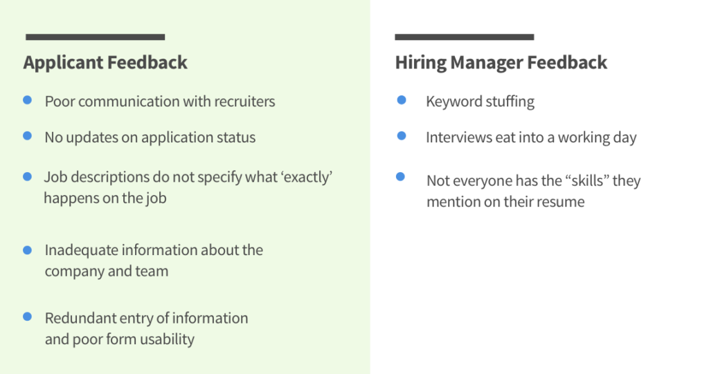
An initial group brainstorming session helped identify the issues that participants could face. To get a sense of what applicants and hiring managers felt about the process, semi-structured interviews were conducted with 6 applicants across differing levels of experience, task mapping was done to identify bottlenecks in the current application process, and competitive analysis helped identify design features.

What do people want from IBM?

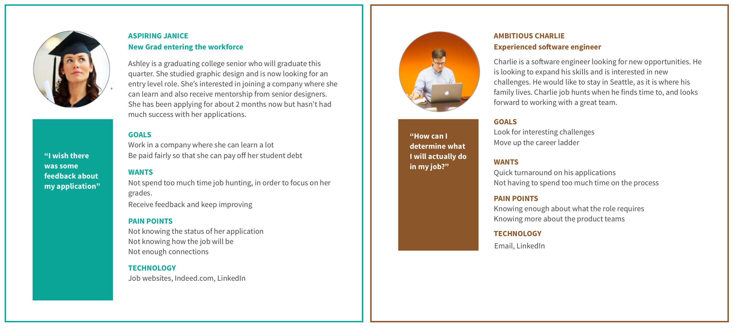
The interviews revealed different motivations for people to use a job application portal. It was interesting to note that people did not just care about the application, but rather the whole experience of applying. They wanted to know what the culture was like, what mentorship they would receive, what they would work on, and more. This was distilled into 2 clear personas.
Defining Design Principles

The evaluation of the current experience led to us creating a set of design guidelines and features. Key design tenets included:
  1. Friendly and personable
  2. Automate when needed
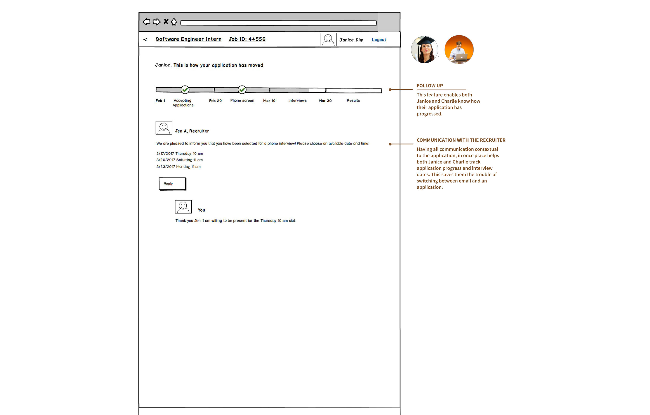
  3. Give feedback to the applicant

Visualizing the experience - Journey Maps
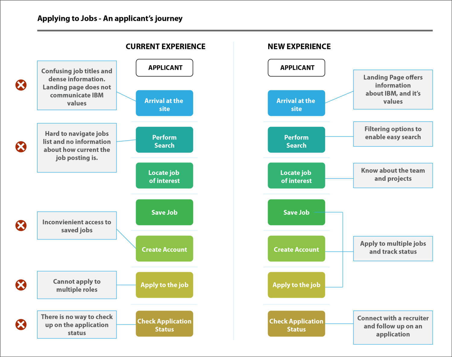
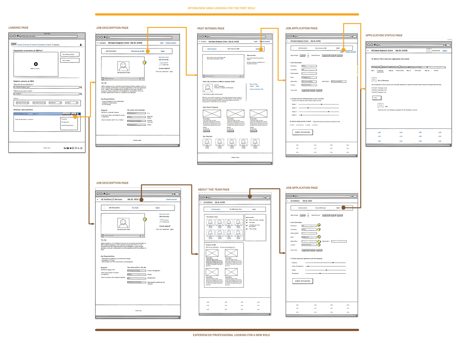
I created a journey map marking pain points along the current flow.

Initial Concepts​

Key ideas were distilled into the design, and the ones that made it, were built out to be tested with users. We wanted to know how effective the ideas were, how easy the site was, to navigate as well as what users felt about such concepts.
These wireframes are explained in greater detail below.

Final Design

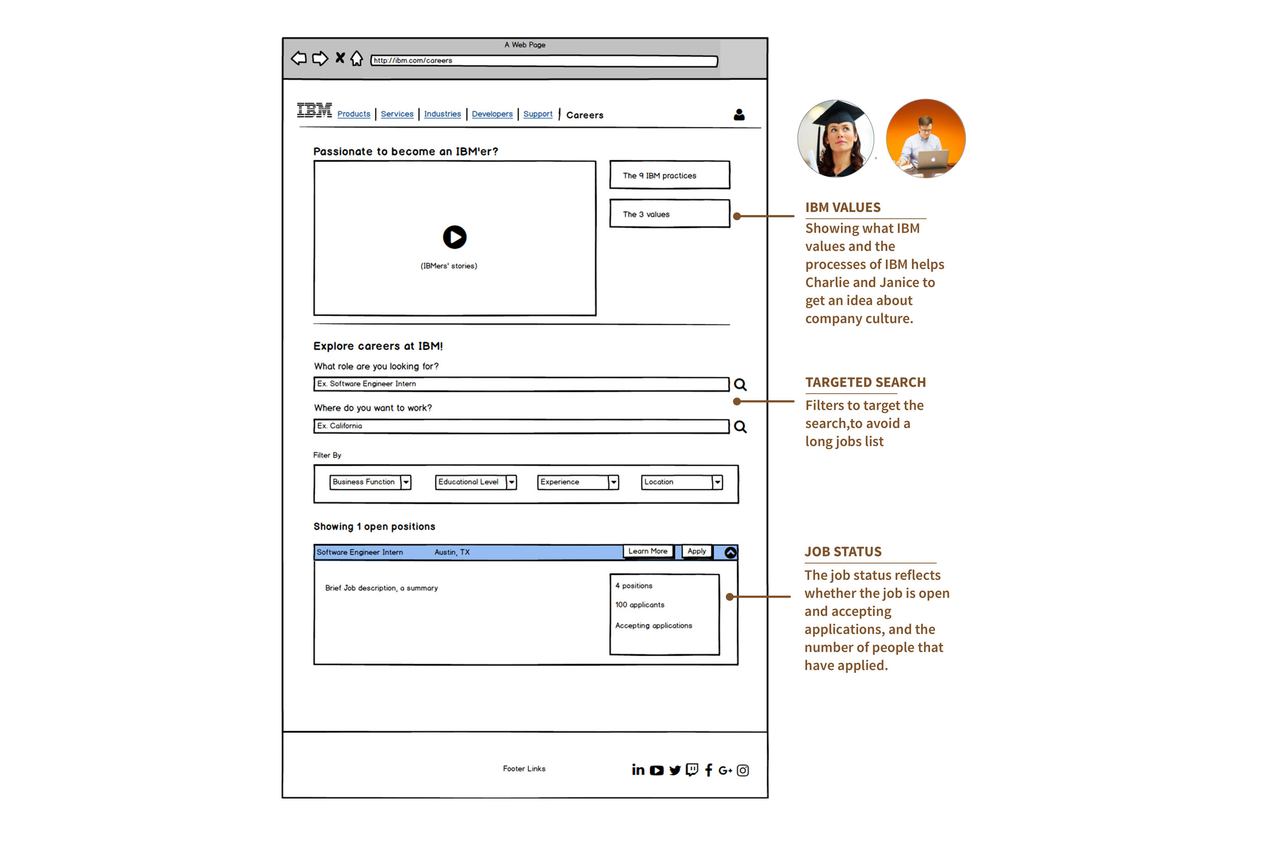
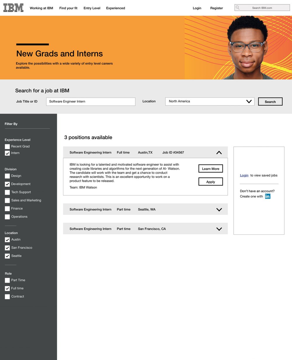
Landing Page with clear calls to action
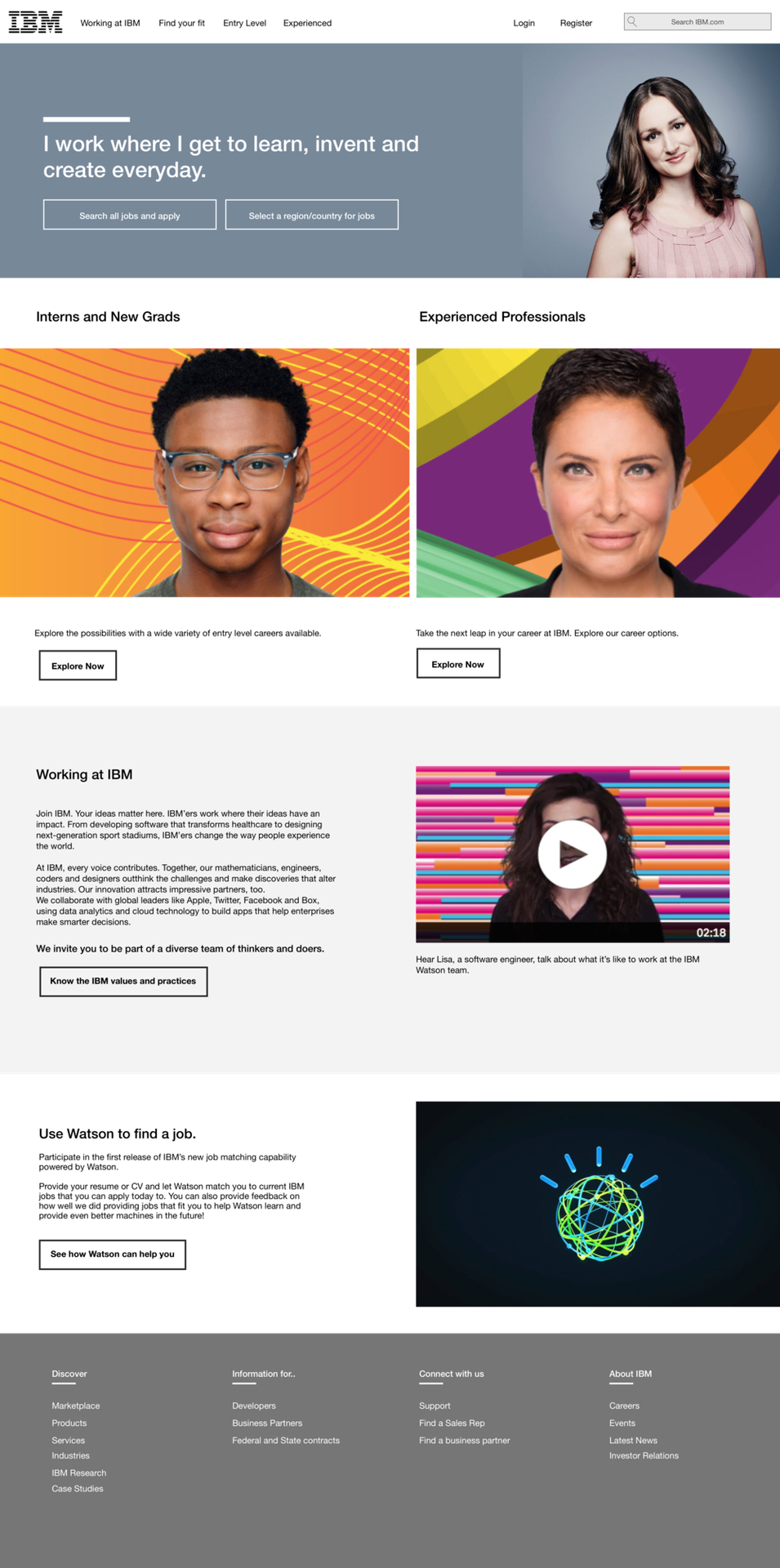
The landing page, designed to be welcoming and friendly. In accordance with the current IBM website, it is designed for two pathways, to separate the needs of the two user groups.

Easy Search and filter Options

Filter by Experience, business division, and the location to easily arrive at the position you are looking for. The accordion UI permits viewing multiple jobs while keeping the screen clutter free and easy to understand.

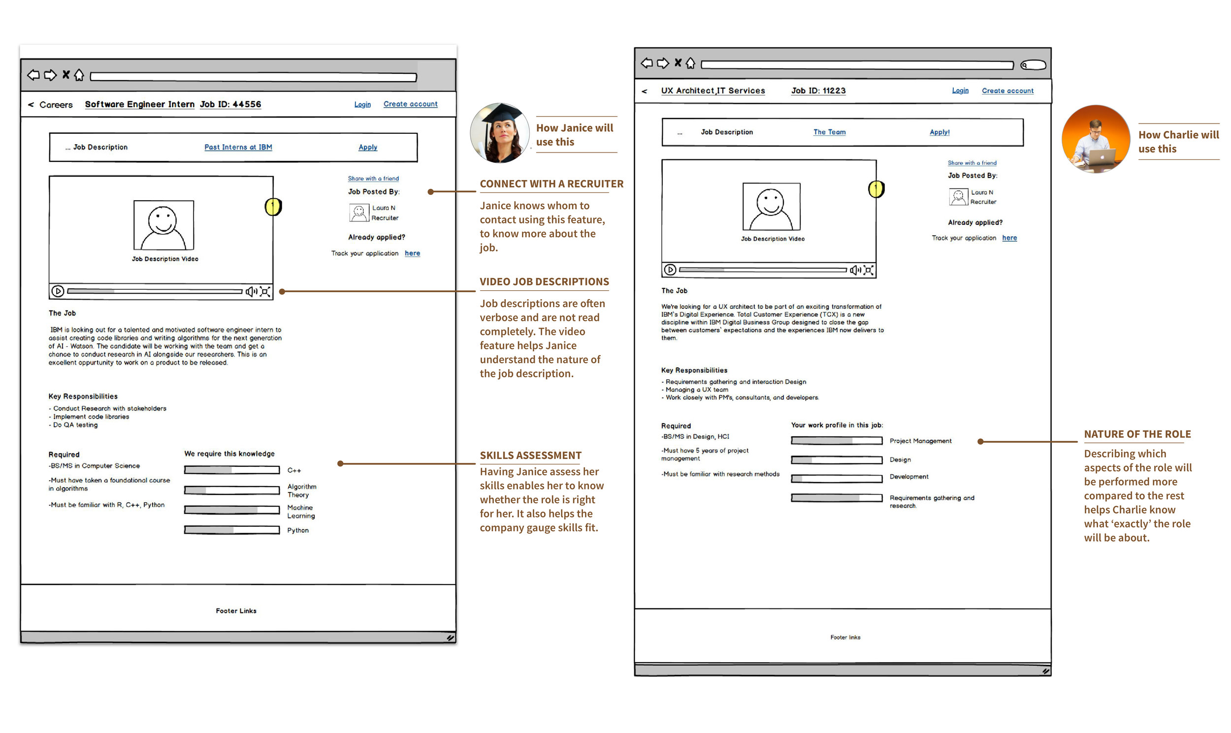
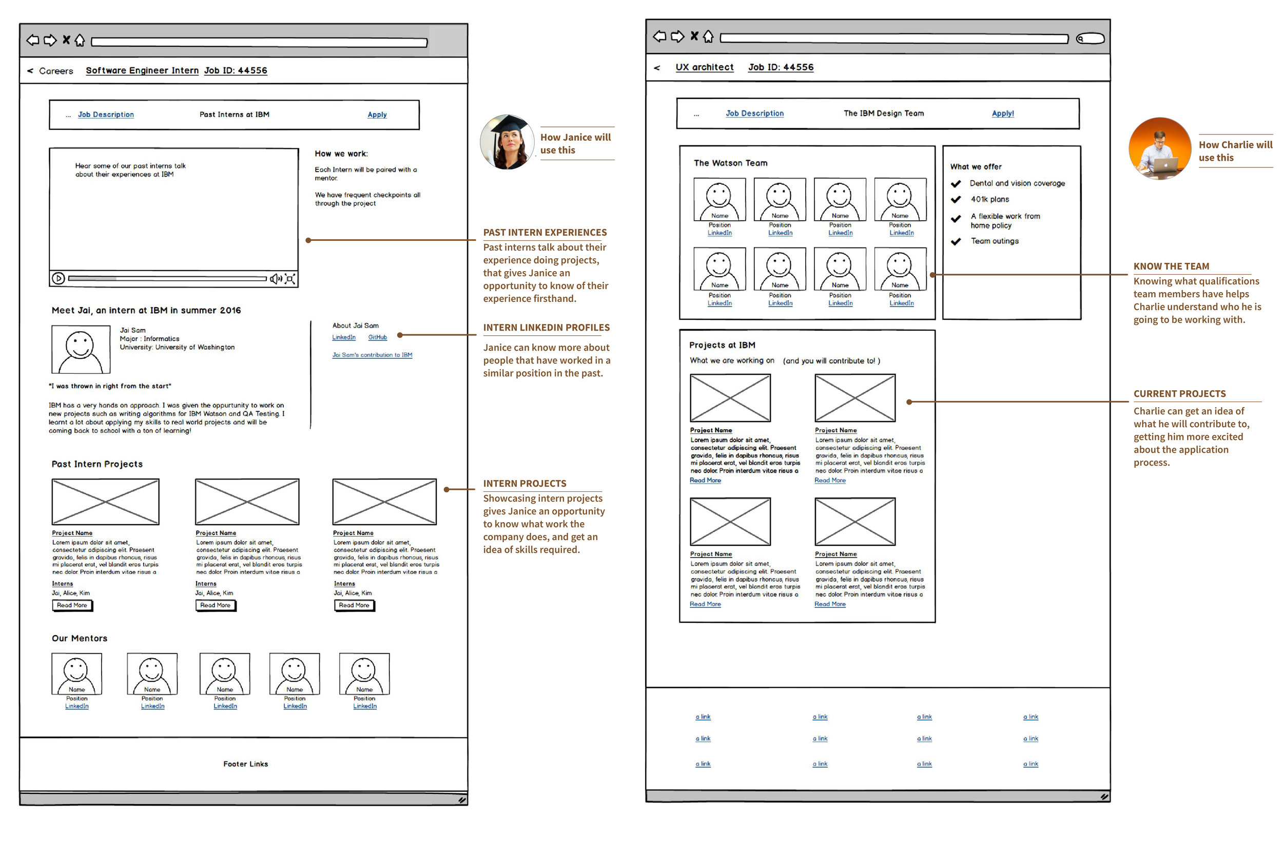
Job Descriptions that list the skills needed
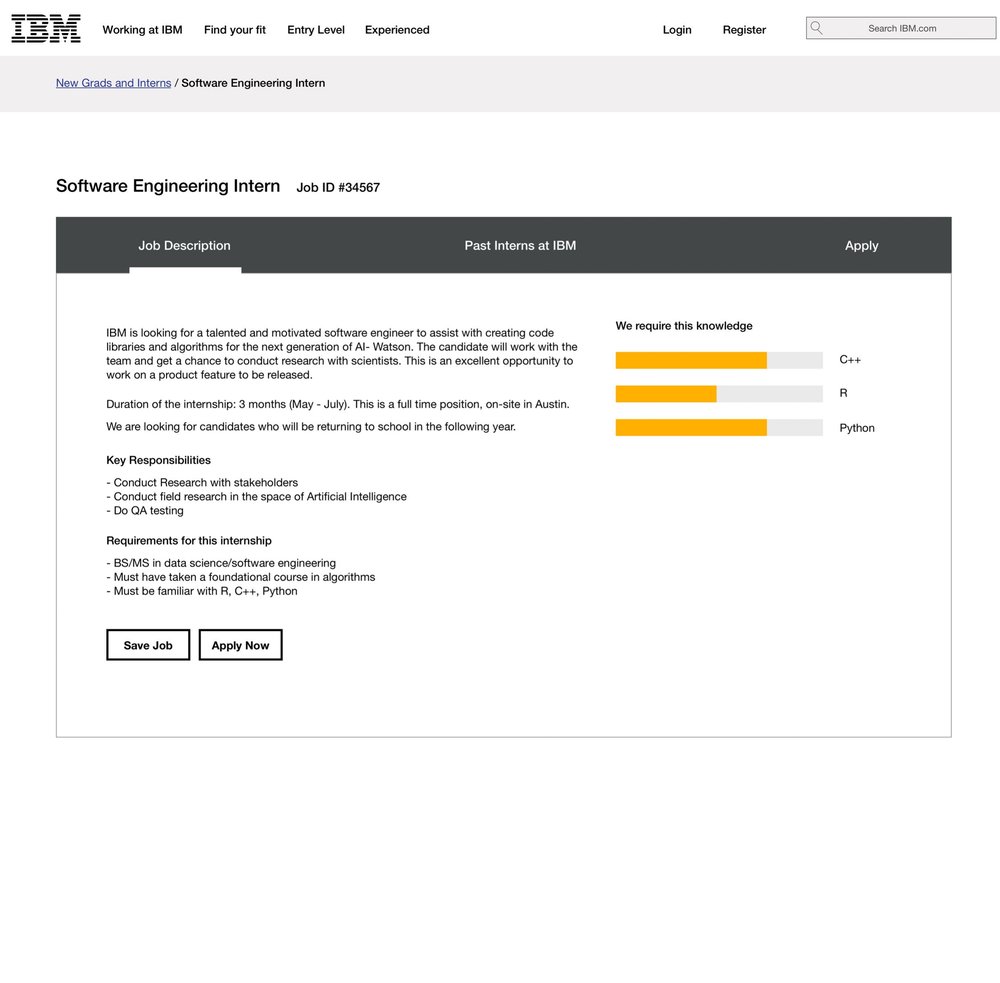
Understand the skills needed, and how much of it is actually required by an employer.

Know about projects and a company's culture
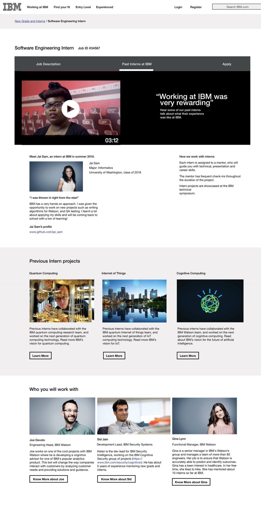
Know the current projects interns people are working on, and the people at the company.

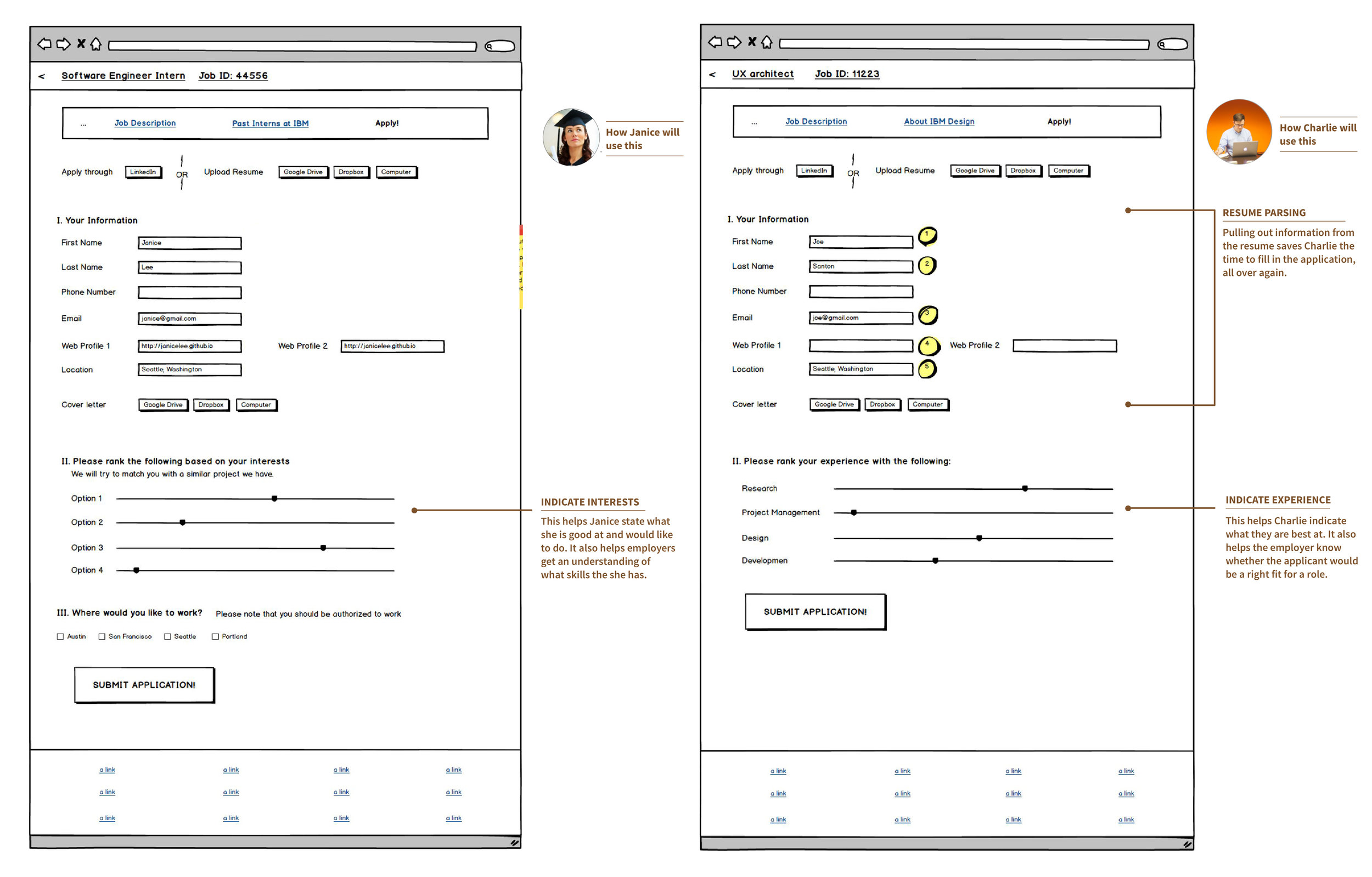
An automated application process, that prioritizes skills and experience
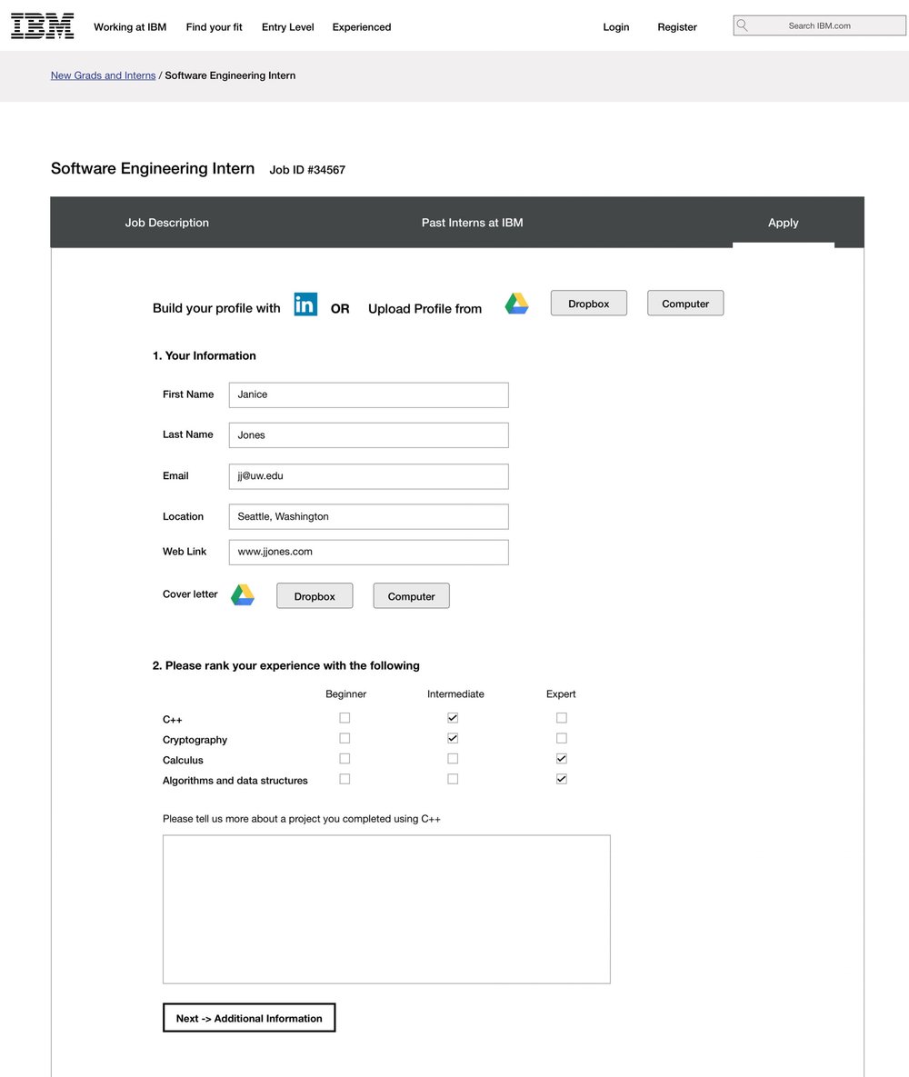
The application pulls up information from the resume, so that the applicant does not have to fill it out again. In addition, marking skills and explaining a project, is a form of conveying experience, and the employer can assess the candidate’s skills realistically.

Confirmation of the job application

A friendly way to acknowledge confirmation of submission.

Reflections

Scoping ideas was a key aspect to this project. The clients wanted a solution that was easily implementable and could integrate with the existing application UX. so I had to work with existing  systems.

Balancing user and business needs

Although the ideal application is one where applicants can send information in with a single click, EEO, Visa Sponsorship and other organizational requirements are still needed.

What I’d do differently

Thinking about the holistic experience is crucial product success. If I had more time, I’d think about how this experience would look like, to a recruiter.