SAP Data Custodian
Overview
The policy creator
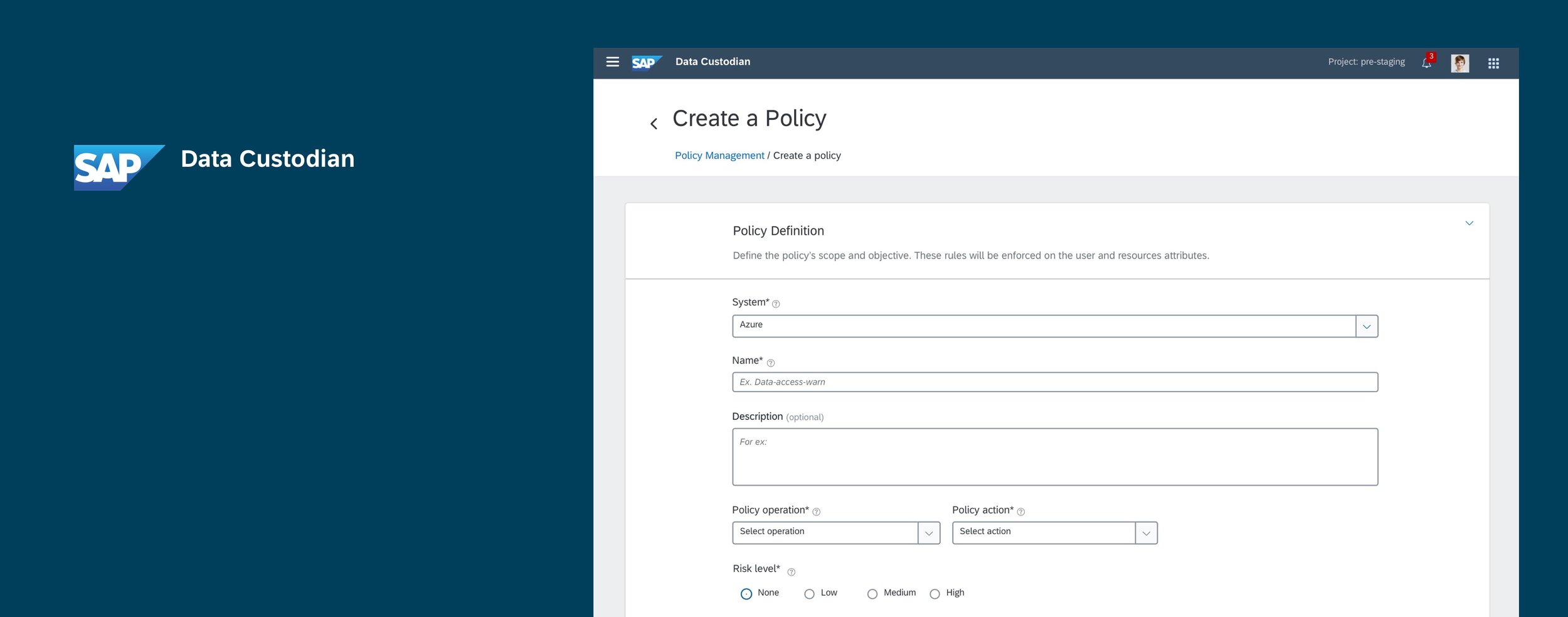
The SAP Data Custodian is a data protection tool that enables organizations having data in the public cloud enforce privacy & monitoring controls. I worked on building an MVP for a core feature within the application- the policy creator. The policy editor enables IT compliance officers to set rules around data access.
Impact
The MVP was demoed at the SAP developer & partner conference- SAP Teched, and is currently being launched in the early adopter program, to gather customer feedback.
My role
Stakeholder interviews | Participant recruitment | Concept tests of chatbot design | Journey mapping | Present findings
Context
Ensuring security and privacy of sensitive customer data in the cloud is an important business concern to large organizations. Non compliance to laws such as GDPR results in heavy fines.

The Policy creator within SAP Data custodian helps compliance officers define rules around around who can accesses their data and from where, and report unauthorized accesses in time.
Persona
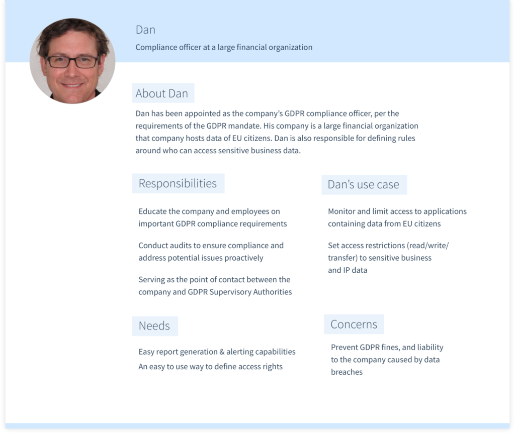
I built the persona from using information from secondary research, which was then validated by customer requirements and user research. Personas also helped to center the discussion amongst stakeholders regarding use cases.
Problems with the current design
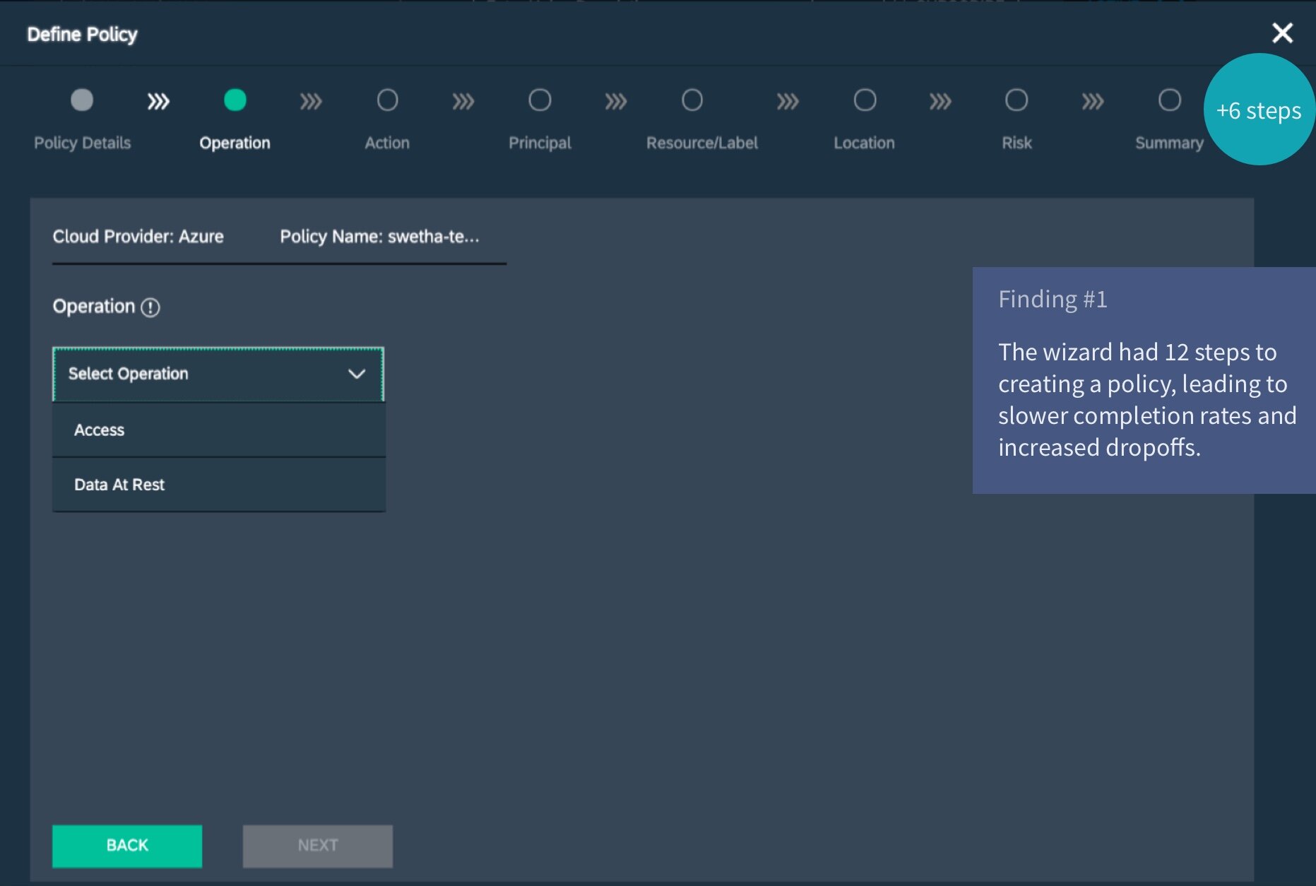
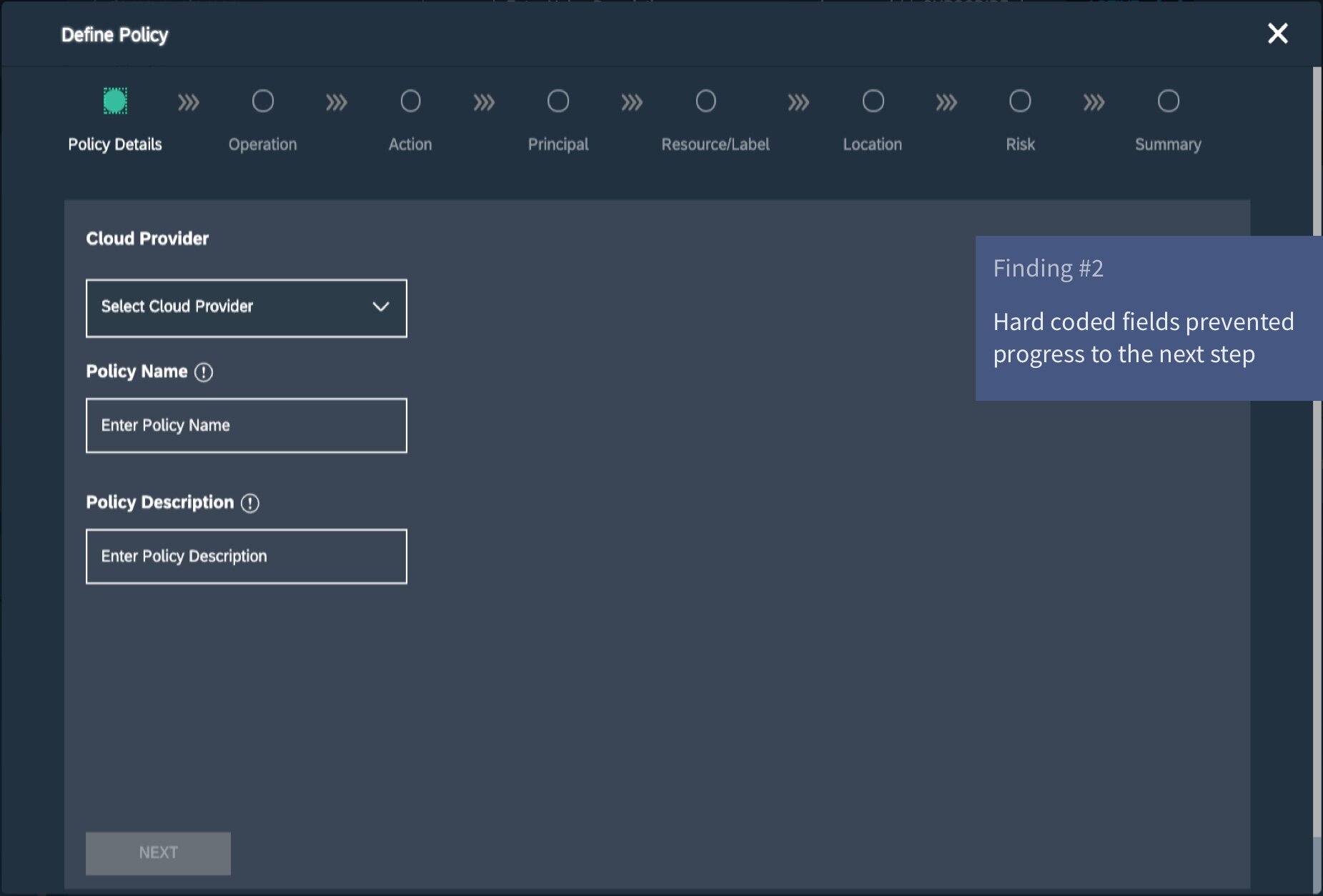
The policy creator existed in it’s V1 when the product was first being built, but was receiving negative feedback from prospective customers during sales demos. This in turn led to a redesign project, which was designed to address usability, scalability and customizability.
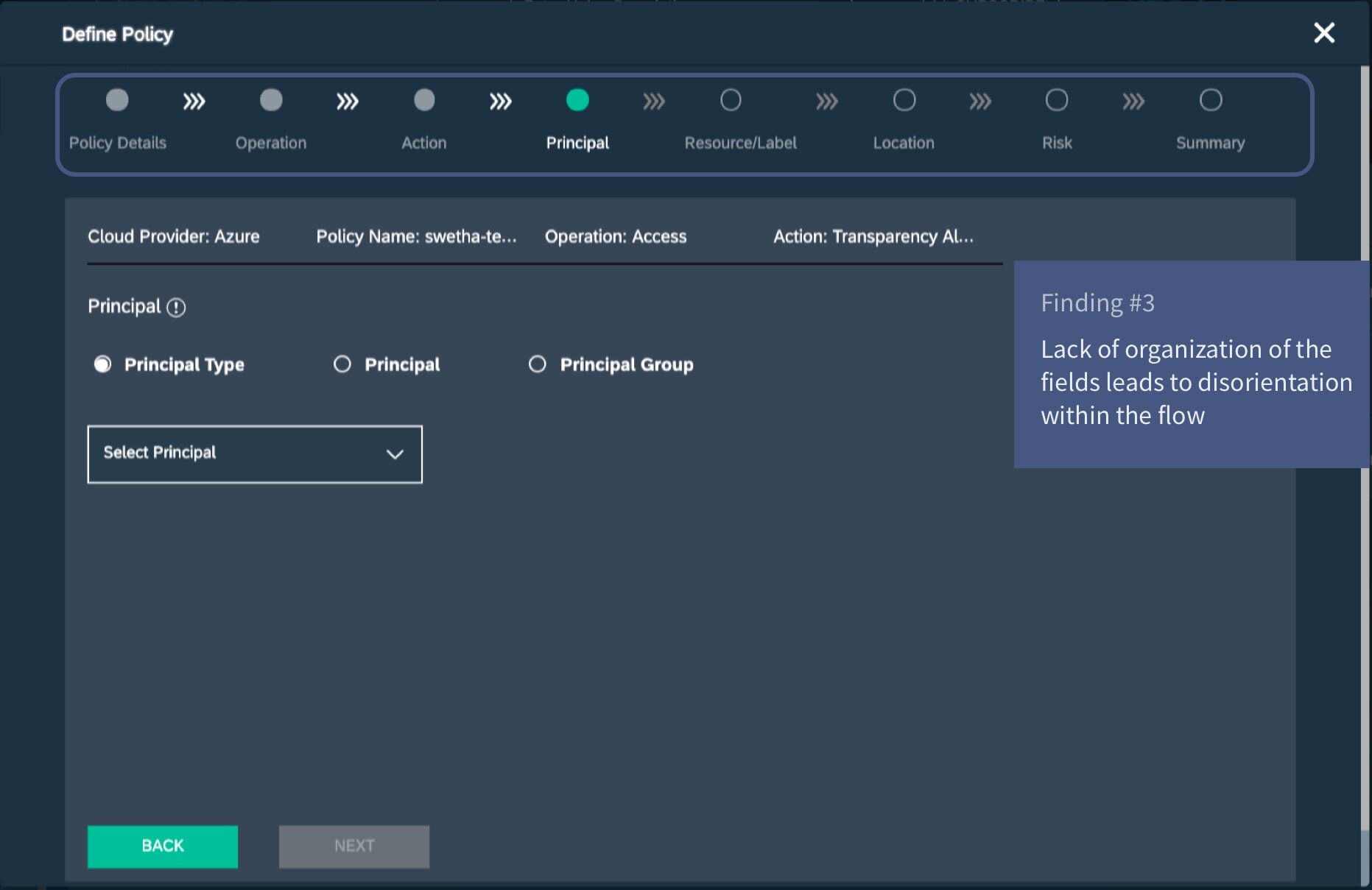
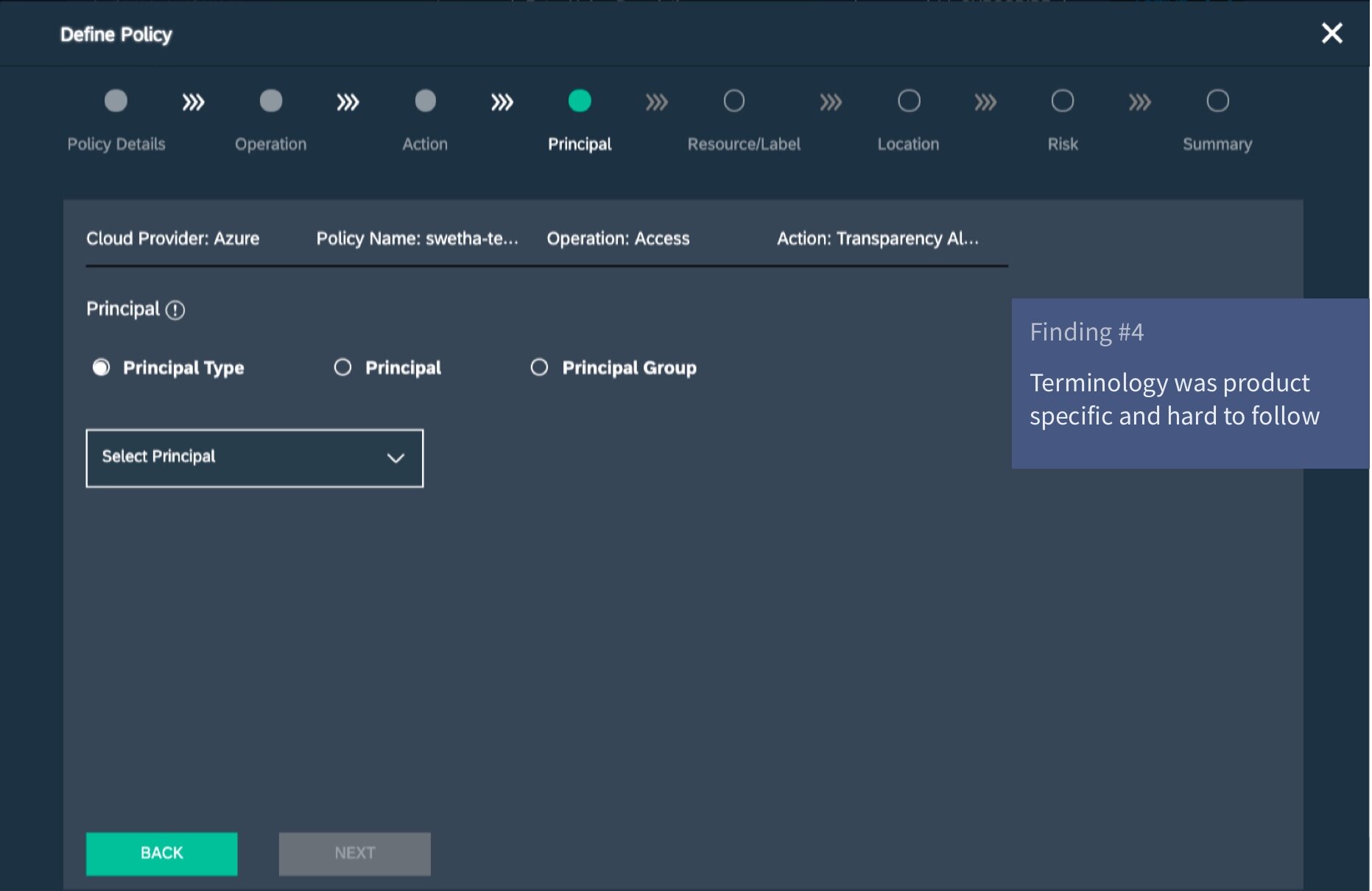
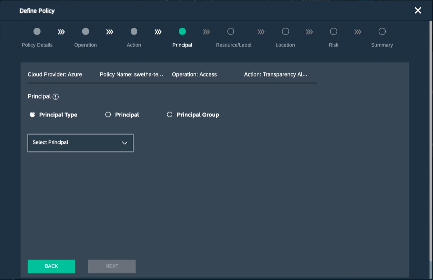
Poor usability resulting in low product adoption
Adding new criteria caused development overhead
A key business requirement was to make the policy creator extensible, to add new criteria based on a customer’s requirement. In the previous design, there wasn’t a way to surface additional requirements without custom coding a new field. In order to make this happen, a customer with additional requirements would have to connect with the development teams to design a custom UI.

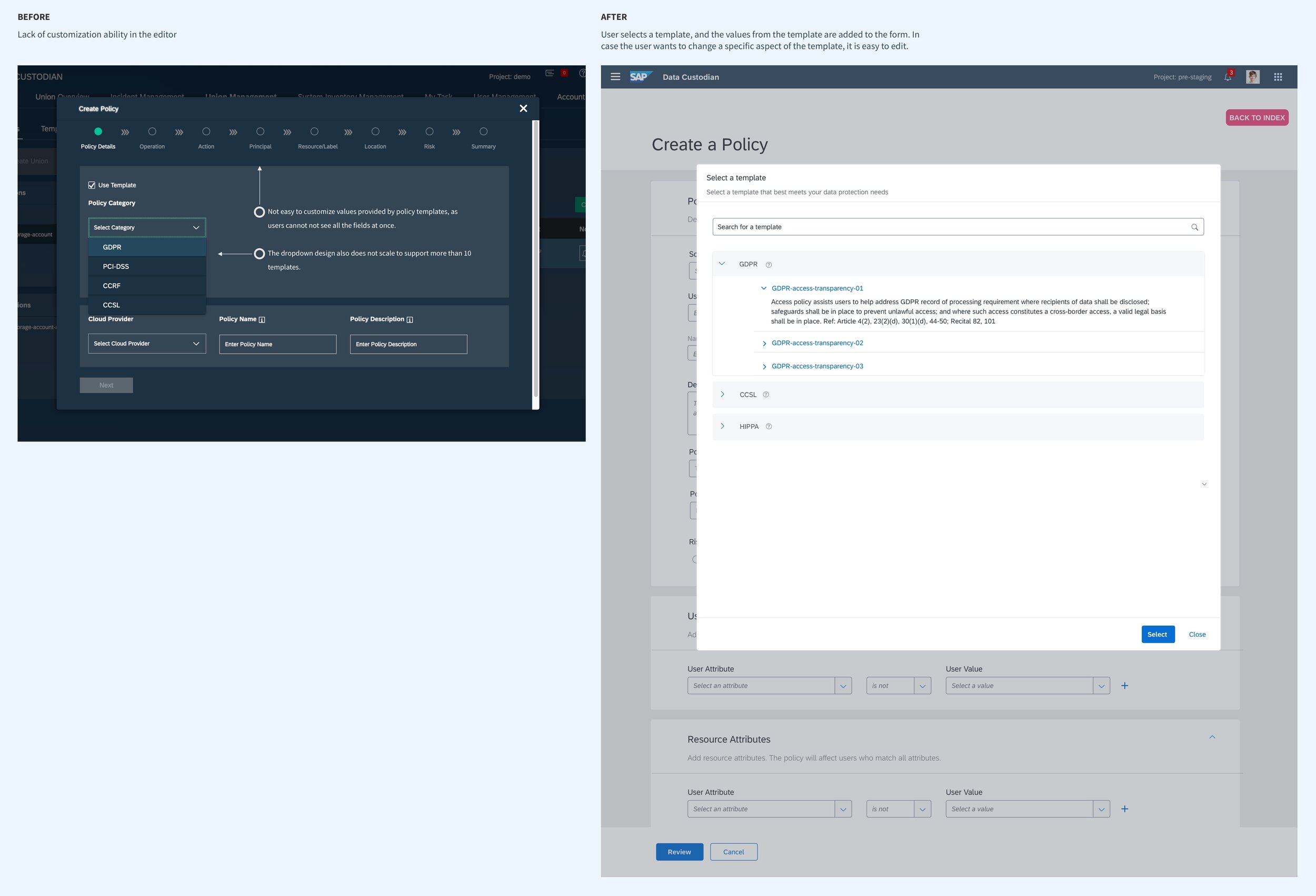
The product allowed users to edit templates, but this was difficult
Customers wanted templates they could edit, to save time and manual processes and also because they expected the product to offer recommendations. The current design forced the user to move through all the fields and edit them individually, thereby offering little visibility into the process.
Defining design strategy
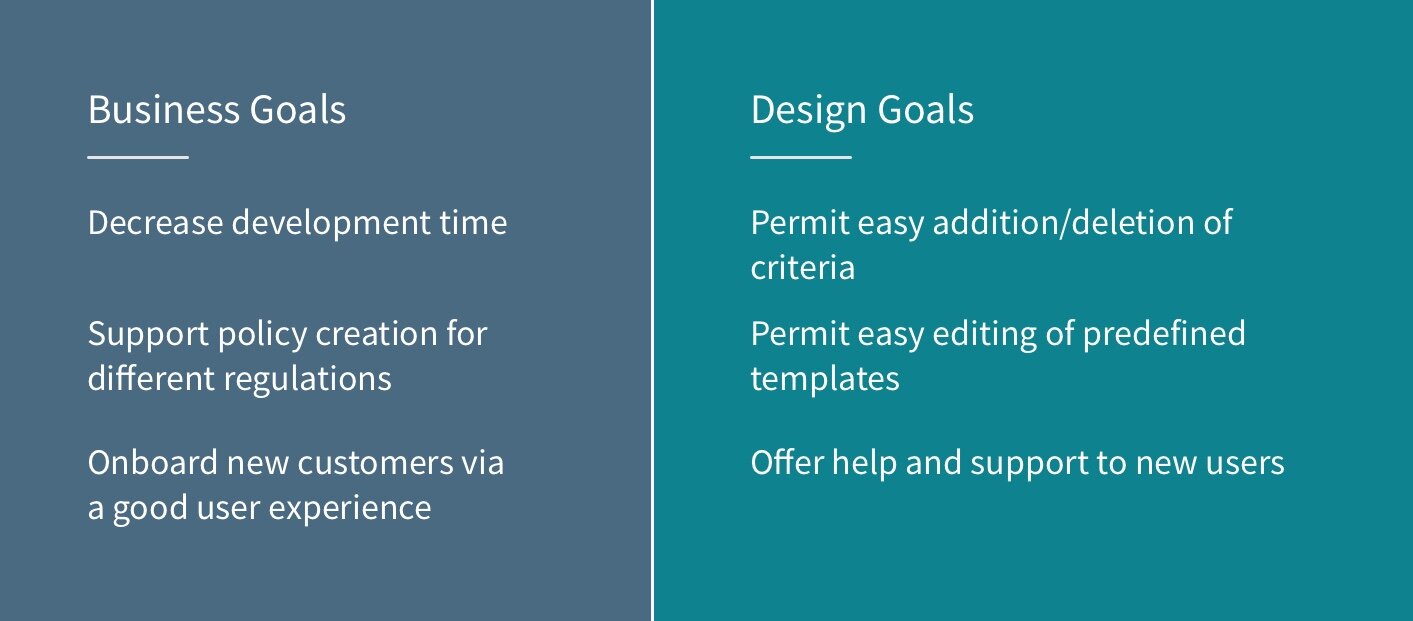
Designing a flexible policy creation framework
The current priority was to support a flexible policy creator framework. Although this could be accomplished, I went ahead and sought out ways in which the number of screens could be reduced, so that users would be able to complete the task.
Competitive analysis
I looked at existing policy applications in competitor applications such as Microsoft Azure and Google Cloud. I triangulated insights to arrive at an optimized flow:
My hypothesis at this point was that if we could sort the information and present it an easy to understand way, users would complete the process of setting up a policy.
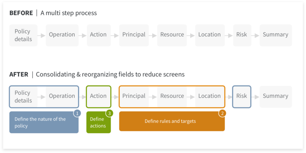
Ideation & assessing feasibility
Sketching helped me brainstorm different ways of accomplishing the design goal: flexibility. My objective was to enable the user to move between the different fields without being hindered, and also enabling visibility of information in case they chose to edit a template.
I explored different ways in which the goal could be achieved. I compared these designs through the lens of: how easily could it offer visibility into the creation process, can the design scale and would the design deviate from existing design patterns in the product.
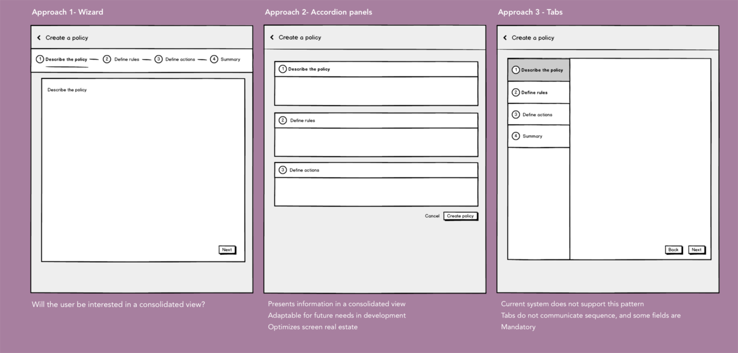
Design evolution| Validating designs
I built low-fidelity prototypes that were tested with a customer. Although I had designed a start to end experience, customer availability impacted what could be tested. Priorities were:
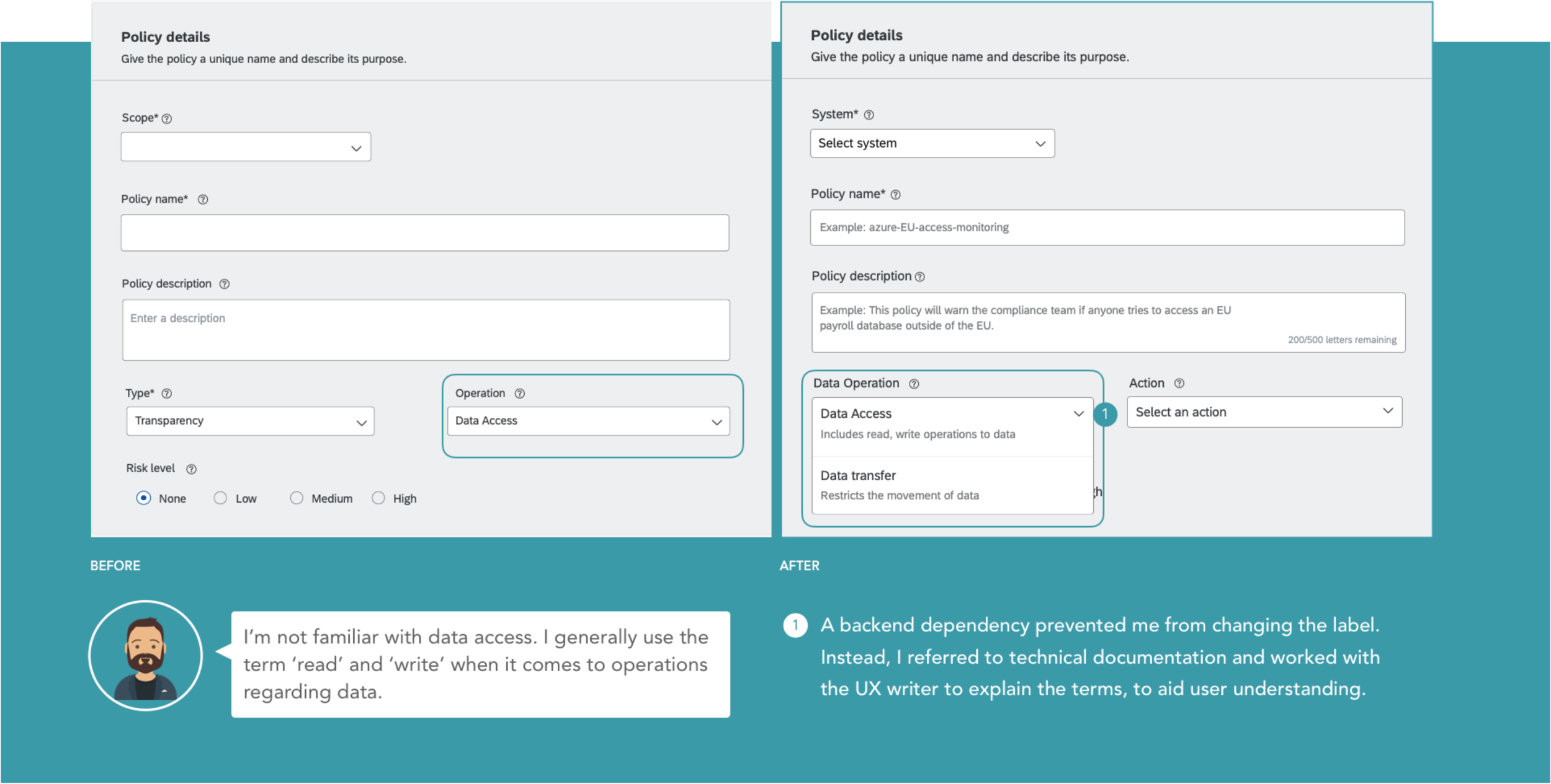
Help text/terminology
If users can understand terminology they won’t need to delve into product documentation
The framework
Can the user understand how to add/remove criteria?
The need for a summary
In design round 1, the summary was abandoned as we thought it would be unnecessary. But stakeholders were divided on this issue, and this was a perfect opportunity to test that.
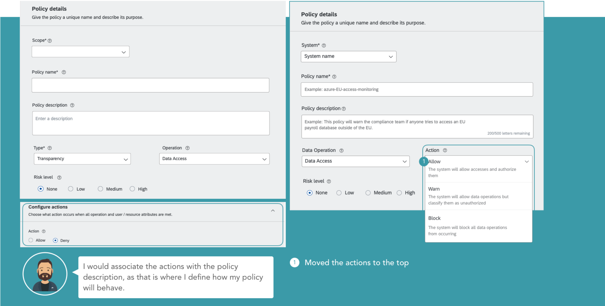
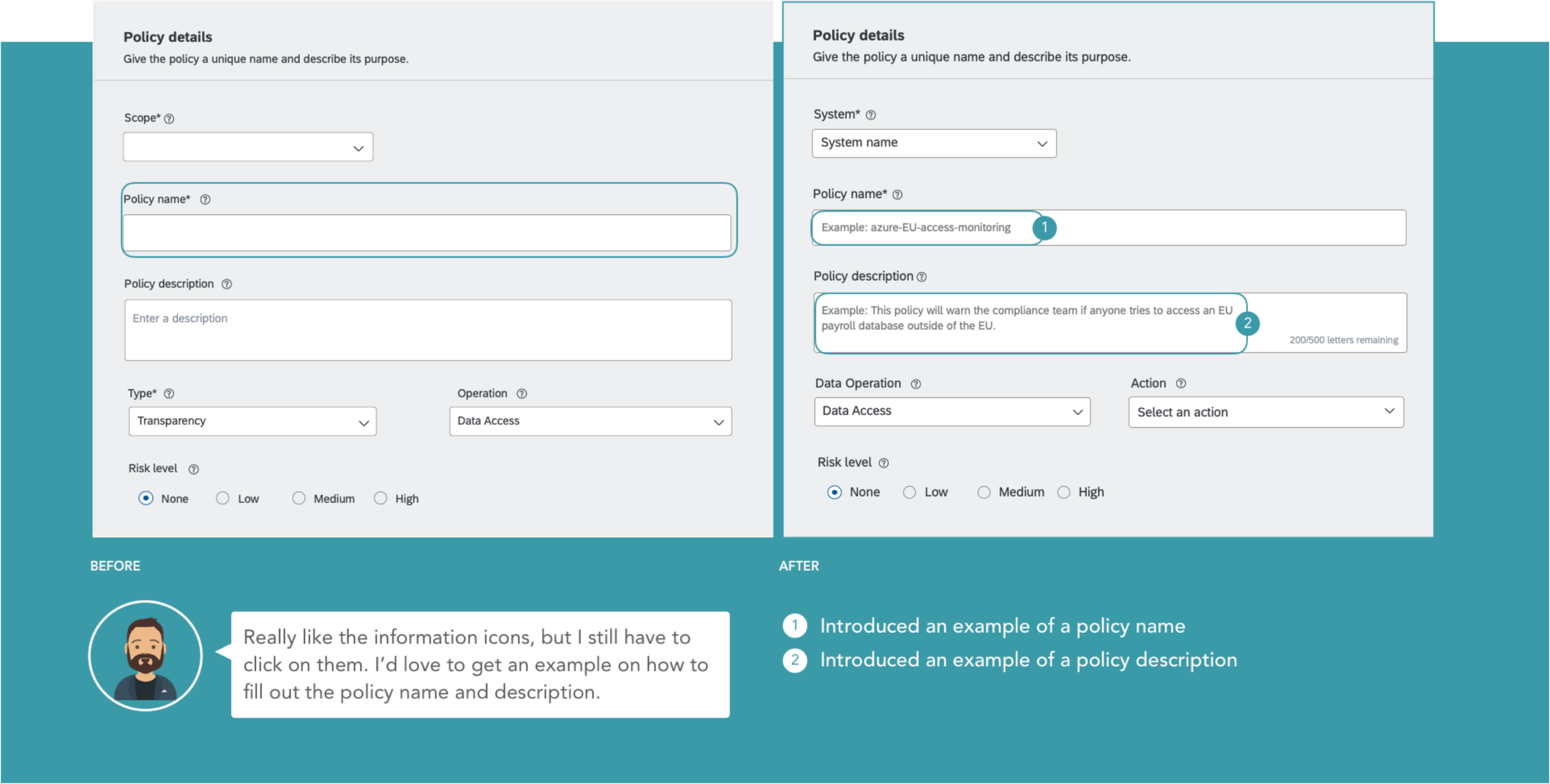
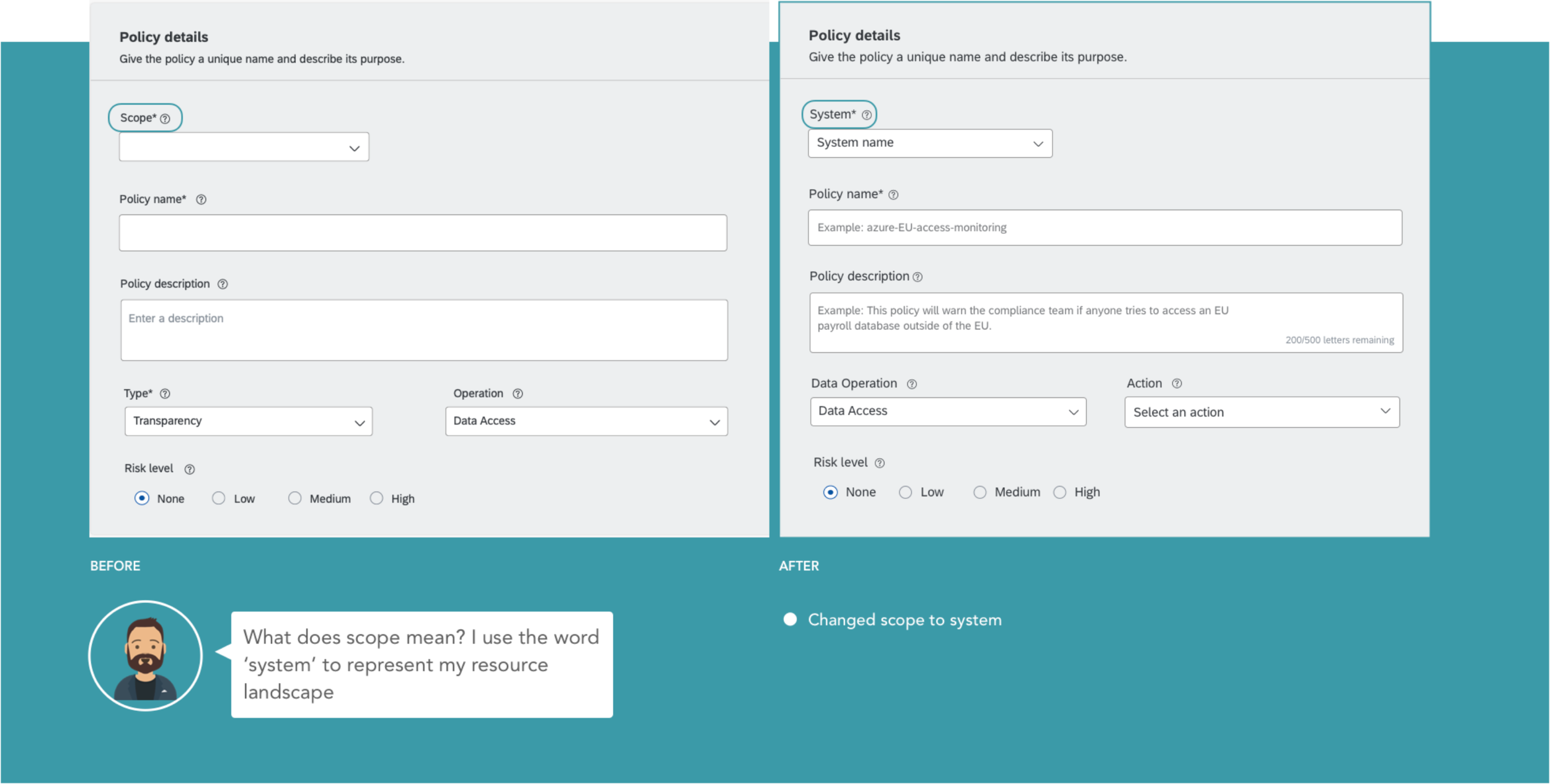
Visual Design | Using the Fiori design system
I iterated on the mockups prior to developer handoff. I relied on the SAP design language – Fiori to borrow components and style the application. The SAP Fiori design system has well defined guidelines regarding layouts, grids, colors and typography. The mockups were handed to the engineering team on InVision, with the visual and interaction specs defined.
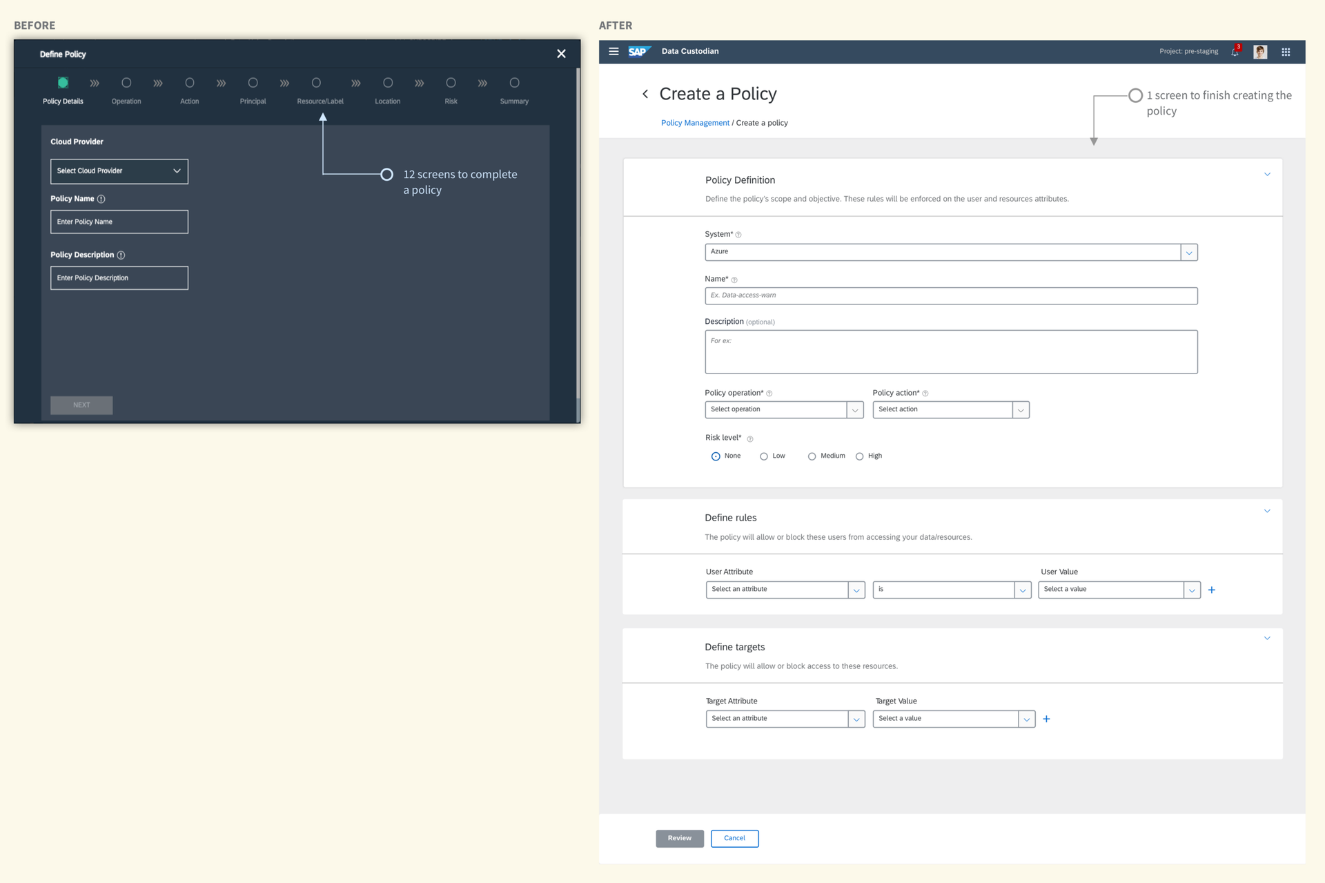
Improvement #1: 6+ screens to one screen
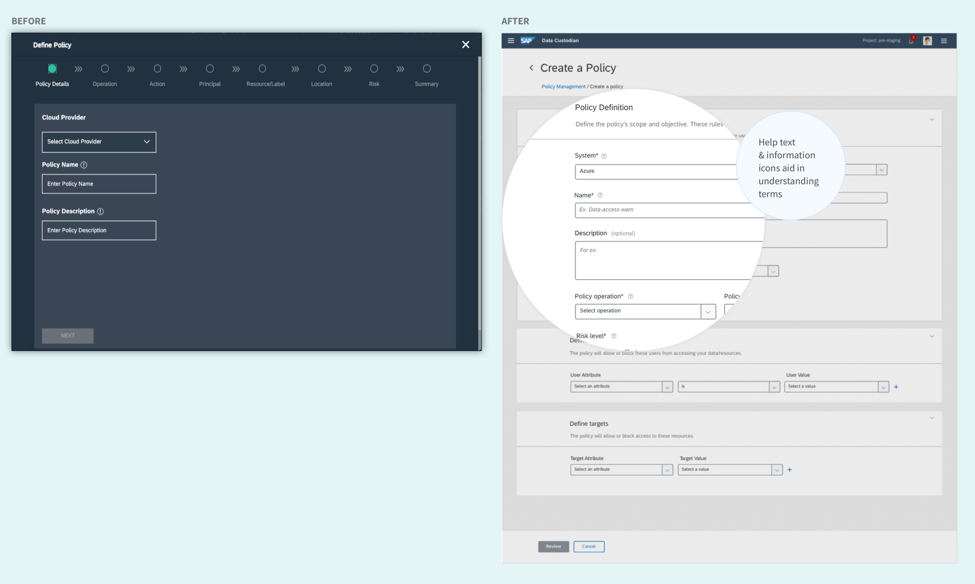
Improvement #2: Writing helptext to aid new users
Improvement #3: Building search & template customization
Impact
The feature was demoed at SAP TechEd and is currently in a closed beta with AWS customers. A few ways to measure success would include:
User Engagement: How many people use the feature to create policies?
Time & cost savings: How much time on average is saved by the user, resulting in more usage over time?
Decreased breakouts: How much customization does engineering have to do, if a new request comes in and breaks the design?
Next steps
Feedback from customer sessions indicate that users want to do as little customization as possible. Which means that there is an opportunity to improve the design of the policy template chooser.
-
Provide the complete details of the policy, and only ask the user to tweak what is relevant for the business case.
-
A modal is not the best design for the template selector, as the number of policies could increase in the future.